"Simply put Ted is the best designer I have worked with in my 24 years in software development. The test of a great designer is whether they can create something from scratch and modify something that already exists. Lesser designers can only do something if they can start from scratch but I have firsthand experience that Ted can do both. I have tried to get multiple designers to modify Telerik components to my liking and Ted was the only person who could do it well. When we gave Ted a chance to do something from scratch it was also amazing. Ted’s work is clean, sleek, and modern. Furthermore, Ted is an honest and humble guy who is a great designer and actually has the proper mentality to be a great programmer too. If I were starting a company and needed a designer, Ted would be the first person on my list."
Professionally, Ted currently manages a small support team at the University of Arizona Foundation in sunny Tucson, Arizona. He was recently promoted to this position after a successful stint in a prior role at the foundation—as a front-end designer/developer.
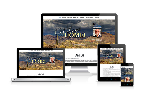
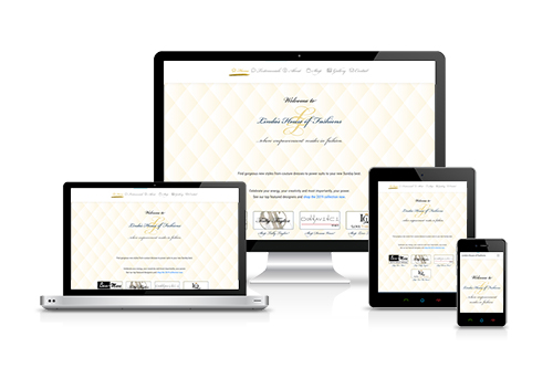
Ted has been designing websites and web-apps professionally for over 20 years and has a background in Graphic Design.
Please contact him via email or LinkedIn.
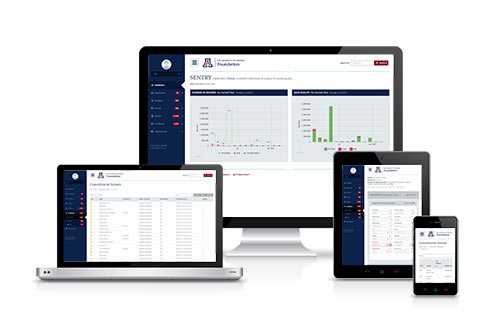
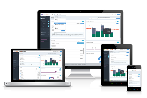
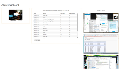
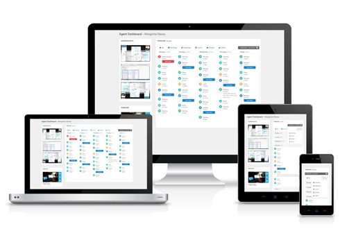
Most recently, Ted designed and developed (from scratch) an enterprise-level proprietary web-app for remediating poor data quality records.
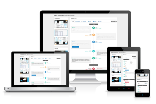
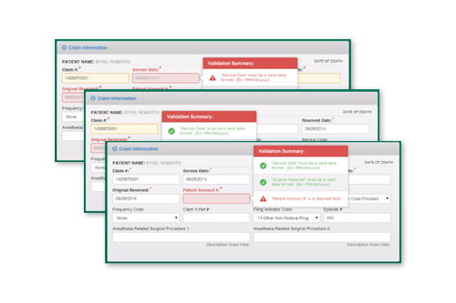
He also recently designed sketches/wireframes and developed hi-fidelity mockups, along with functional prototypes for a complex claims processing system for the Health Care industry. He works well with Product Owners, Project Managers, Architects, Business Analysts, and Developers to solve complex user-experience and user-interface problems in a fast-paced agile environment.
Personally, Ted enjoys learning about a variety of topics, including: Christianity, drums, nutrition, government corruption, parenting, photography, volleyball coaching and more. Ted also enjoys tweeting about life and UX, eating Taco Bell, drinking Dr. Pepper and Baja Blast, listening to music, staying up-to-date on web design/trends, spending time with family and friends, playing volleyball, meeting new people, designing in general, and much more...
"If UX is the experience that a user has while interacting with your product, then UX Design is, by definition, the process by which we determine what that experience will be."
– Laura Klein
The [internet]age-old discussion: Web Site vs. Web App. What's the difference? Is there a difference? Are we just labeling things to sound clever or smart?
It is my belief that there's one very simple and obvious difference between the two.
Let's discuss...
"When you design for your primary persona, you end up delighting your primary persona and satisfying your secondary persona(s). If you design for everyone, you delight no one. That is the recipe for a mediocre product."
— Alan Cooper
Modal Disclaimer
I know what you're going to say... "Modals are for hacks." "Modals don't work on mobile." "Modals SUUUUCK, and YOU SUCK for using them!" Yadda, yadda, yadda...
The fact of the matter is that while there are certainly cases against modals (on desktop as well as mobile interfaces), there are also times when they are an entirely appropriate design solution.
Typically, modals are used for one of three things: 1) Interruption, 2) Feedback/Correction, or 3) Deep Diving.
In the context of the work examples on this website, I find it entirely appropriate to interrupt the user in order to take a deeper dive into the examples. Moreover, we understand the user is interested in viewing these work examples, so, here a modal would be an expected behavior/interaction–yes, possibly even on a mobile device.
Out of the box, the latest version(s) of Bootstrap resolve a number of older issues with modal windows (especially on mobile)–which is one of the many reasons I really enjoy this framework.
In the field of UI/UX, it's really important to remember; design solutions/patterns are defined by the user and their expectations (based on common behavioral patterns). Most times the best-practice design patterns are... the best practice. Other times, we as designers need to decide what works for a user within a given context–even if it seems to go against the mainstream philosophies espoused by those in positions of "authority."
It's all about what's best for the user. :)